A new health data heatmap of Australia is a warren of useful and interesting rabbit holes. Dive in and you’re bound to have questions.
There can be no media group that hasn’t been tempted at one time to start a digital-only story with the generic and quite famous Daily Mail type of clickbait heading that simply says “click on this, punters – it’s interesting”.
Have you clicked? (Yes, of course, as you wouldn’t be reading this if you hadn’t).
It’s a pretty risky thing for a media brand to try, as if there’s nothing actually that interesting, and I’m just clickbaiting you all for a bit of Saturday traffic to the site. I could do a fair bit of brand damage (probably no more than I already do, though, by ranting on too long with pretty bad grammar and spelling – although I blame my subs for that [Oi! – Ed.]).
The proof of the pudding of “interesting or not” will be in how many clicks we get versus how long you guys stay on and read (time on site), and then, how many actual clicks we record into the subject of this story via a link, which I’ve deliberately buried down the page a fair bit in order to get you to read a bit of the story first.
So what is so interesting?
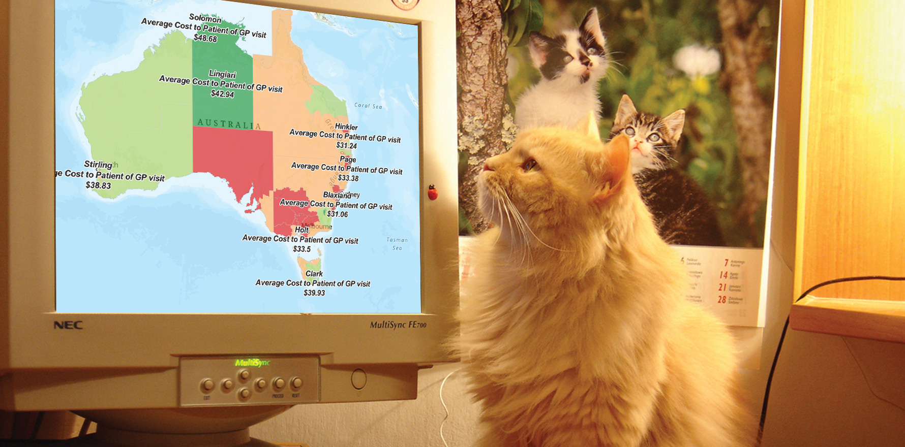
Would you be interested to know how much on average out-of-pocket patient costs are in your electorate, compared with, say, an electorate just a few postcodes away?
Would you like to know what out-of-pocket costs are on the northern beaches of Sydney, which is one of the richest-average-income electorates in the country? Would you maybe like to cross-match income and out-of-pocket costs by electorate?
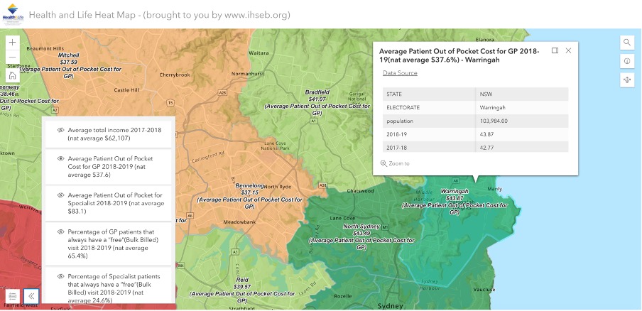
On just a brief visit to the newly built Health and Life Heatmap (a project of the International Health Standards and Ethics Board) you will note at once that the northern beaches (I live in a small house in Manly, hence my interest) is one of the richest regions by average income in the country, and perhaps unsurprisingly, has one of the highest average rates of out-of-pocket charging by GPs in the country.
If you drop a few other data settings into your map and do a quick look over the country, you might quickly come to the conclusion that if you want to be healthier than anyone else in the country, live on Sydney’s northern beaches (of course, this really might map almost wholly to income for obvious reasons and the good health just flows from wealth).
Even in a short visit to this map, checking out North Sydney, you might quickly notice (as I did) that at a particular magnification of the heatmap that captures the electorate of Bennelong which is also a pretty rich region just a few miles away from North Sydney, the average out-of-pocket patient costs drop really quickly. Like, strangely quickly, in that it doesn’t seem to match with income like it does in Manly (Warringah).
Stranger still, if you keep going west, as you can because this is exactly like those Google maps where you can go anywhere and magnify where you are, there are in some cases some suburbs and electorates that charge on average a bit more than Bennelong. Which also seems fairly counterintuitive.
Why is it so?
I have no clue.
When I started on this map, I almost instantly went down about five separate rabbit holes where I had questions.
This is why this heatmap is so interesting, in my view.
When you take a whole lot of data about GP billing and behaviour, and mash it up with other interesting data about incomes of the region, voting intentions, and other social and health-related data, and then you throw it all on an expandable geo map of Australia, what you suddenly realise is there’s a whole lot of things that you took for granted that maybe you shouldn’t have.
You immediately have a lot of questions when you look at this map, and so far the creators haven’t even entered any of some of the really interesting data they think they’ll be able to get and put on the map. Things like GP average income by postcode, ICU beds by region and PHN funding per GP practice per PHN region. Think of that last one. We suspect that PHNs might get more in funding than all the GP practices combined in some regions and wow, if that is happening, what does that mean?.
Getting access to, deciphering, calculating and loading such data is ambitious, but not impossible I suspect.
But even in its beta outing the heat map reveals enough about how GPs and other health professionals are operating from region to region to be at the very least voyeuristic.
The map already has some interesting hospital data on it, and its owners are looking for really good data points such as ICU beds to add by region, which could be explosive in the next few months of covid.
ICU bed data is really hard to get hold of.
Why, we wonder out loud.
Perhaps, we speculate, because if you map ICU beds to region at the moment it might become very obvious very quickly that certain key regions of the country (mostly remote and rural regions) are up a certain creek with no means of creating any propulsion if our opening-up strategy on covid, based on average vaccination rates of a state, is a bit out of whack.
I’m digressing here, because the operators of this heatmap haven’t got the ICU data yet and they possibly won’t get it because it’s just too sensitive. But The Medical Republic understands that the Northern Rivers region of NSW, which is everything above Ballina to the Queensland border, including famously under-vaccinated Byron Bay, has only 12 ICU beds available.
If this is the case, and things start to get a little rough up there as we open up to regional travel on 1 November, then things could really go belly up because in normal times most of the population in this region head for the Queensland border and one of their shiny big Gold Coast health establishments when they need an ICU bed.
Which might be a bit of problem, given the stance of the Queensland Premier for now.
Back to this heatmap.
Why on earth would anyone attempt to make all this data so easily usable and comparable?
I’m going to try to answer that question below the link I’m about to give you.
Two things … when you get to this link, scroll down the page to the actual link that gets you to the heatmap if you want to avoid the explanations about it – it’s there at the bottom, when it probably, like a Google search page, should be right up at the top where you can use it. But I suspect the builders of this aren’t good at UI and UX (“user interface” and “user experience” if you’re a bit internet and app challenged) yet.
Here’s the link to the heatmap so you can go and have a bit of a play.
Just remember this site is beta and it’s not on robust servers yet, so it might be a bit slow and clunky.
How come the government hasn’t come up with this product already?
After all, nearly all of the data is coming from the government; a lot of it from the Department of Health (DoH), Medicare and the Australian Institute of Health and Welfare (AIHW).
It has not been very easy data to get and digitise by the way.
On the map iteration I’ve used as an example above, the out-of-pocket data came from a fairly obscure and hidden-away file somewhere inside our federal parliaments website. It was data produced specifically by the DoH for a senate enquiry. It isn’t produced every year, this lot looks like a one. It took a while to digitise it and get it into the map application.
Why is data like this in this format, and hidden away like this, in this day and age?
There is more thinking and data beyond these key sources than any one government department has remit over so you might speculate that it’s not been done by government yet because each government department is so focussed on its own work.
There also might be a bit of inter-departmental politics going on.
But you would have thought this would be a great project for the AIHW, at the least. It’s sort of what they do. They are, after all, now in charge of getting all that population data from GPs via the ePIP program, aggregating it and sending it back to GPs in a form that will help them all be better health providers.
It’s very hard not to go a bit conspiracy theory here (it’s apparently trendy these days and even if you’re credible you’re apparently allowed to do it – I think just because the internet exists so you just can) and say that maybe putting all this data together in a format like this and making all these comparisons – which start to generate a lot of questions from healthcare providers, related social-reform entities and the like, about why things are the way they are – isn’t entirely convenient for the government at this point of time.
And that’s why no one in the government has done it yet.
Not that the government is a bad operator or has the wrong intent. Mostly if you manage to get deep inside the departments of health, state and federal, you have lots of well-meaning people trying to make things better in there somewhere. Mostly. You also have lots of politics, bureaucracy, power plays, lobby group influence in there too of course.
It’s just that the sort of questions that a really good data resource, like the operators of this heatmap want it to be, could start to get embarrassing sometimes for government.
Like, if they had managed already to map ICU beds to regions and start matching data on resources and capability. Or they manage to get PHN data on regional funding and match it to GP generated incomes by region.
That’s just not a picture that state health departments really want the public and even key health care provider communities such as GPs to have at their fingertips at the moment, you suspect.
But this, although a good reason to do the project, is not actually the main reason the group which has built this heatmap is doing it.
They are doing it … drumroll … because they think that a giant underlying issue with our medical system is that we don’t have any formalised standards or guidelines for measuring and monitoring clinical performance in our health system, in particular against a set of ethical standards for the profession.
You need ethical standards with clinical ones because health is about life and death and money, so there are a lot of ethical issues you need to put some measures on to give us all perspective around resource limitations.
David Dahm, who is an accountant, not a doctor, and who is involved a lot in this project (and who attracts the odd bit of controversy among his peers and others for various reasons), points out that other professions such as accountants and lawyers have developed profession-wide standards and guidelines that manage to mash in key ethical criteria, and that such standards and guidelines have helped these professions grow and deliver much more transparent and better services to consumers and to the government.
That does sound like a win-win-win. It also sounds hard.
In the case of the accounting profession, the standards are now globalised as well as localised, and form the basis for how accountants interact with their global and local tax regimes, which is a hugely important function for any developed country.
Dahm will say to you all sorts of things are getting messed up in our healthcare system, and that if the profession could ever agree to a common set of clinical and ethical guidelines, patients would be a lot better off.
He also says things might end up a lot more efficient, so government might be even happier.
I’m not going into all the arguments that Dahm, and others who support him in the IHSEB venture (there are quite a few eminent local and international experts and doctors who support the ideas of this organisation), make here, as this article was just meant to generate a lot of traffic on a slow news Saturday with a great clickbait heading I’d always wanted to use.
But you can see some immediate practical things that such a set of standards might bring the profession of medicine, and the daily lives of doctors themselves.
One of them, which is something we bang on about a lot, and are about to bang on about some more this coming week because they’ve just released their annual report, is how badly the PSR works for doctors.
One thing we don’t often say when we lay into the PSR, AHPRA and the DoH, as we so often do, is that when you really think things through, the PSR and AHPRA (and yes, DoH) are possibly doing the best they can with what they have – which isn’t much.
They need to monitor and police bad doctor behaviour. That they do it so badly, you could argue, is because doctors don’t pipe up and offer them a much better framework in which to operate the PSR and AHPRA.
What if such a framework should include a standard set of agreed clinical and ethical guidelines for doctors, created by and maintained doctors, probably with some input from the government, given they have to pay for the system in the end?
With such a set of guidelines, it would be much harder for doctors to argue that the government doesn’t provide them any speed limits on how they charge for services, and that by forcing them to guess, as the current PSR and AHPRA regime does, you are obviously going to catch out doctors who in normal circumstances would largely be innocent.
If doctors had a set of uniform clinical and ethical standards and guidelines, then doctors would have a set of speed limits that they set and agree among themselves and which government also agrees to so the system would be much easier to navigate.
This is exactly what accountants did in the end for government and that’s how the ATO tends to assess things when they do their thing in this country, that is, within the guidelines and context developed and laid out by accountants who represent their punter business clients who have to pay tax.
It’s a set of guidelines that are good for accountants, good for business and business people, and good for the ATO and the government.
Dahm, I think, is trying to do the same thing in medicine.
He says that the accounting regime is self-regulated by the accountants and that the medical professional should be as well. He says that if the profession goes this way, it will have entered a process where it works with government. Although groups like the AMA , ACRRM and the RACGP tend to put on a front of working closely with government, there’s a lot of ongoing tension in these relationships and, as a result, the system.
This heatmap is a reasonably natural iteration of the whole IHSEB project, if you think about it.
If you start putting a whole lot of data together in interesting ways, mapping it and making it accessible to everyone – healthcare providers, patient advocate groups, patients, social service entities, healthcare institutions and so on – then you are potentially starting to democratise important healthcare data, with, I’m guessing, a view to providing some framework for developing uniform set of standards and guidelines in medicine for doctors and government.
Anyway, if you’ve read this far, thanks for clicking and here again is the link to the heatmap.
